the project
Liposomal Technology – The attraction of using liposomes to deliver nutrients, supplements, and drugs into the body is that they are easily absorbed by the gastrointestinal tract, and in so doing the additional encapsulated molecules are absorbed at the same time.
This overcomes the barrier that many products face, by effectively being absorbed into the body.
The body will often break down many complex molecules before they are absorbed or will just not readily absorb them so absorption levels are reduced.
Liposomes are easily absorbed so the products encapsulated by liposomes achieve much higher blood dosage levels than those found in non-encapsulated products such as traditional tablets or oils. This is one of the many benefits that are shown in our liposome research.
the role
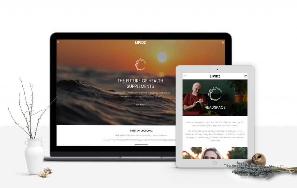
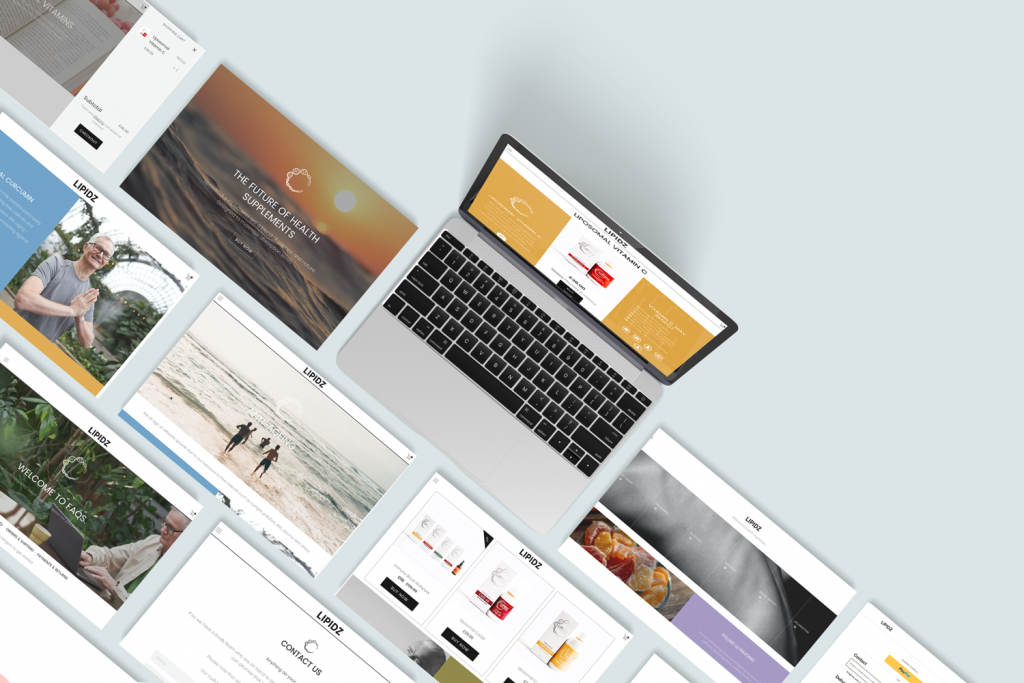
My goal here was to create a website that also needed to be able to explain this new technology, and what was on offer, in a clear and friendly way, sell the benefits of the product succinctly, and encourage consumer uptake across their target markets.
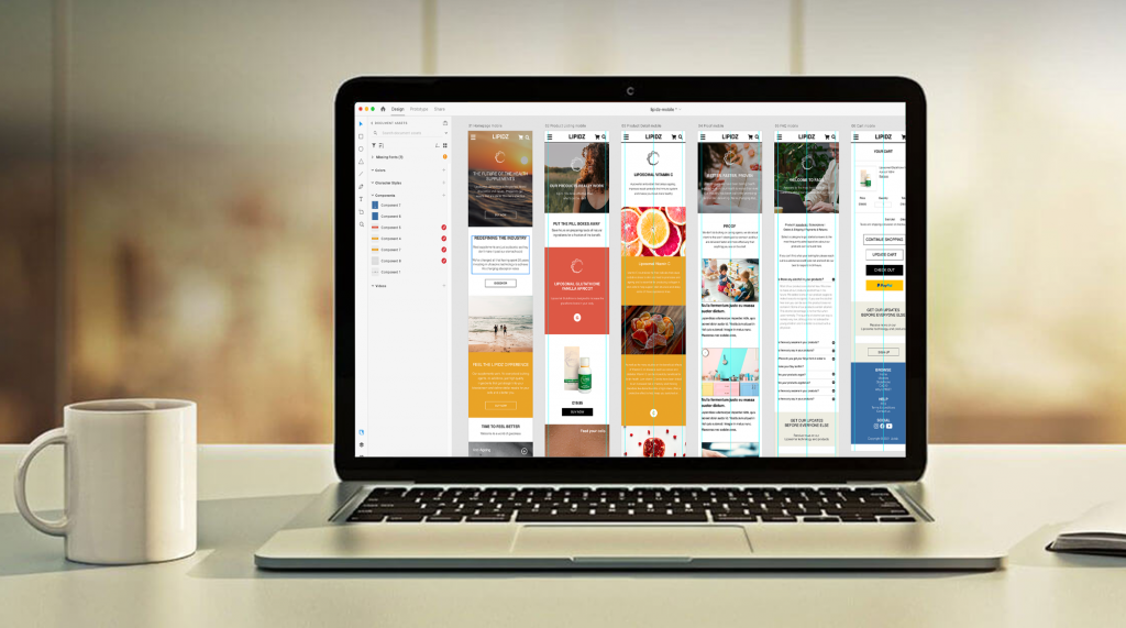
I was focussing on the mobile-first version which forced me to consider what is, and what isn’t important. Every design will require a mobile view, so for me, it’s the logical place to start.
Important things at the top, and less important are go below that. It’s that simple.
Once we’ve covered the basics on small screens, then growing that design out to a larger screen is a much simpler proposition. This is why I believe that designing mobile-first is always the smartest way to go.
I have been the designer for the website, defining the frameworks and the core user experience. I designed marketing materials, designed and coded the front end of the websites.
My tools for this project were: Adobe XD, Photoshop, Illustrator, and Visual Studio Code.
logo
I have created 2 different versions, but on the page, I use it without the text, so it works as an icon.
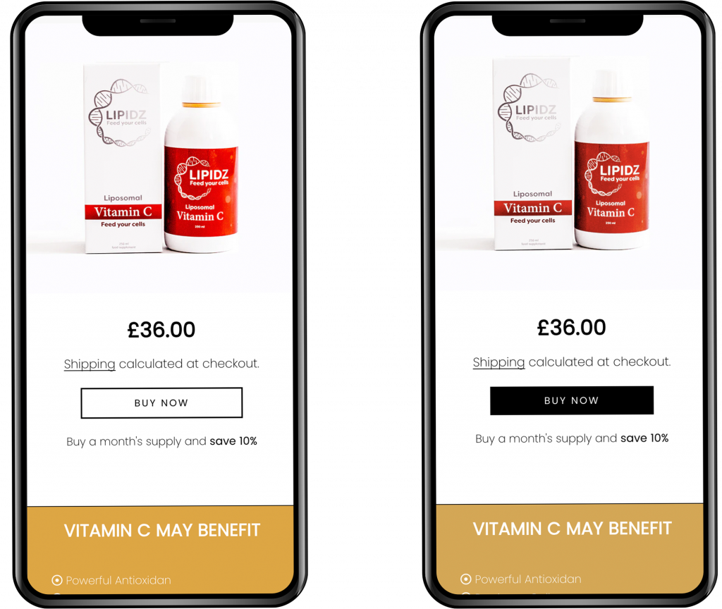
A/B testing
I have tested different layouts for the product page.
In version one (A), the CTA listed above the product image and the product description with the same outlined version that we have for the buttons on the rest of the site.
In version two (B) I tried a more aggressive, full black button, and kept it in the same position.
The conversion rate was 40% more on version two.
the outcome